¶ Project Theme — PrimeVue
When the PrimeVue framework is selected, the Project Theme screen allows you to control typography, layout regions, drawer behavior, and component styling based on PrimeVue’s design system. These settings define the visual structure and UI consistency of the application.
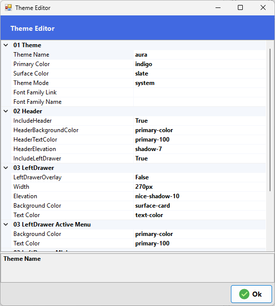
¶ 01 Theme
Theme Name: Selects the PrimeVue theme preset that controls the overall visual style.
Font Family Link: URL reference used to load the selected font family.
Font Family Name: Defines the primary font used throughout the application.
¶ 02 Header
Include Header: Shows or hides the top header.
Header Background Color: Sets the header background color.
Header Text Color: Defines text contrast inside the header.
Header Elevation: Applies shadow depth to the header.
Include Left Drawer: Enables the sidebar navigation area.
¶ 03 Left Drawer
Left Drawer Overlay: Enables overlay mode where the drawer appears above content.
Width: Defines the sidebar width.
Elevation: Sets shadow depth styling.
Background Color: Sets the drawer background.
Text Color: Defines text color within the drawer.
¶ 03 Left Drawer Active Menu
Background Color: Background color for the currently active menu item.
Text Color: Text color for the active menu item.
¶ 03 Left Drawer Mini
Mini Mode: Enables a compact sidebar mode.
Mini Width: Defines the width when mini mode is active.
¶ 04 Components
Border Radius: Controls rounding applied to UI components.
Default Card Shadow Style: Sets the default shadow style for cards.
Input Filled: Enables filled-style input fields.
Component Font Scale: Adjusts overall font sizing across components.
¶ Applying the Theme
Click OK to apply the selected theme settings to the project. The new visual style will take effect the next time the application is published.