¶ Project Theme — Bootstrap 5
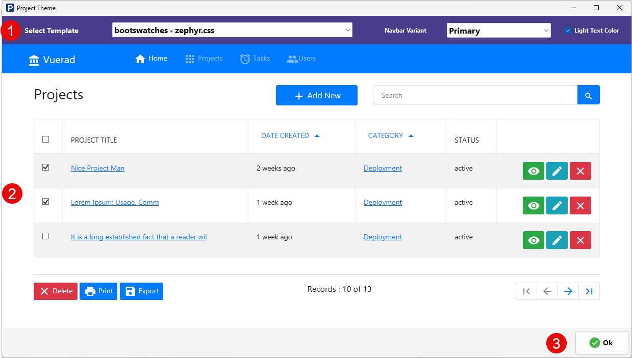
The Project Theme screen for the Bootstrap 5 framework allows you to control the visual style of the generated application. It provides ready-made design themes, navbar color schemes, and header text contrast settings, along with a live preview area.
¶ Select Template
This dropdown lets you choose from pre-built Bootstrap-based themes (such as Bootswatch themes). These themes define the overall look and feel of the application, including colors, typography, spacing, and component styling.
Selecting a template instantly updates the preview so you can see how your application will appear after publishing.
¶ Navbar Variant
The Navbar Variant option sets the color style of the application’s navigation bar using Bootstrap’s standard contextual color classes.
Available Bootstrap variants include:
- Primary
- Secondary
- Success
- Danger
- Warning
- Info
- Light
- Dark
This selection affects the background color of the navbar and visually distinguishes the header from the rest of the interface.
¶ Light Text Color
This option controls the text contrast used in the navigation bar. When enabled, the navbar uses light-colored text, which is suitable for darker background variants. Disabling it results in darker text, typically used with light backgrounds.
¶ Theme Preview Area
The central preview section displays a live sample page styled using the selected template and navbar settings. This allows you to visually evaluate layout, colors, buttons, tables, and navigation before applying the theme.
¶ Applying the Theme
Click OK to apply the selected theme settings to the project. The new visual style will take effect the next time the application is published.