¶ Project Menu Configuration
This screen is used to define the application’s navigation structure. It controls the items displayed in the left sidebar and the top navigation bar, which together form the primary navigation system of the application.
By default, RadSystems automatically adds list pages for all selected database tables to the navigation. You can reorganize, group, remove, or create new menu items as needed.
¶ Menu Style
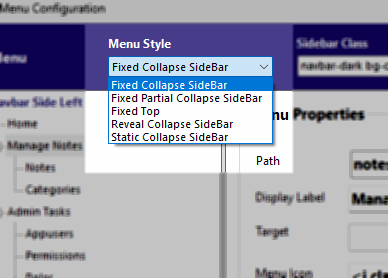
The Menu Style option determines how the sidebar behaves visually and interactively. Available styles include fixed, partially collapsible, fully collapsible, reveal, and static sidebar modes. This setting affects how users expand or collapse the navigation during use and influences the overall layout experience.
¶ Sidebar Class
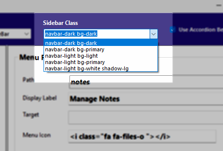
The Sidebar Class defines the visual styling of the sidebar. These classes come from the UI framework chosen when the project was created. You may select from the predefined class list or manually enter a class to apply custom styling. This controls colors, backgrounds, and shadow effects of the sidebar.
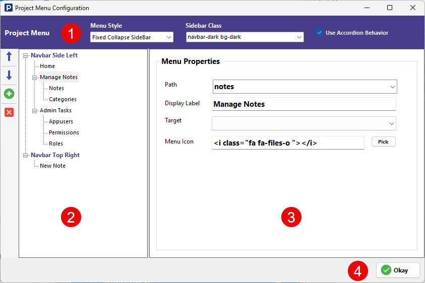
¶ Menu Structure Panel
![[rs-projectmenu-menuitems.png]]
The left panel displays the full navigation hierarchy.
There are two main navigation regions:
-
Navbar Side Left – The primary sidebar menu
-
Navbar Top Right – Items displayed in the top navigation bar
Menu items can be nested to create multi-level navigation.
Controls available:
-
Up / Down arrows – Move the selected menu item within the hierarchy
-
Green + button – Add a new custom menu item
-
Red X button – Delete the selected menu item
You can group related pages under a parent item to keep the navigation organized.
¶ Menu Properties
Each menu item has configurable properties that determine its behavior.
Path defines the route that opens when the menu item is clicked. This usually corresponds to a page or module path in the application. It's mandatory to set the Path for the menu item, or else the menu item will not be included in the app navigation bar in the generated application.
Display Label is the text shown in the navigation bar for that item.
Target specifies the HTML anchor target attribute (for example, opening in the same window or a new tab).
Menu Icon defines the icon shown beside the menu label. Clicking Pick opens the icon selection dialog based on the icon framework chosen during project creation.
¶ Saving Configuration
Click OK to save menu changes. The updated navigation structure is applied the next time the project is published.
¶ Menu Item Visibility
Menu visibility is automatically controlled by the Path associated with each menu item.
When Authentication and Roles & Permissions are enabled, RadSystems checks whether the logged-in user’s role has access to the page defined in the menu item's path. If the role does not have permission to access that path, the menu item is hidden from the user.
In multi-level navigation, if a parent menu item is not accessible to the logged-in user based on role permissions, all of its child menu items are also hidden automatically. This ensures the navigation reflects only the areas of the application the user is authorized to access.