¶ Page Design
RadSystem Studio uses the Bootstrap Layout components to position items on the browser view. In this way, it favors the device-sensitive, responsive or mobile-first design, which adapts to the size of the screen where a web is displayed.
This is one of the most powerful features of RadStudio Systems.
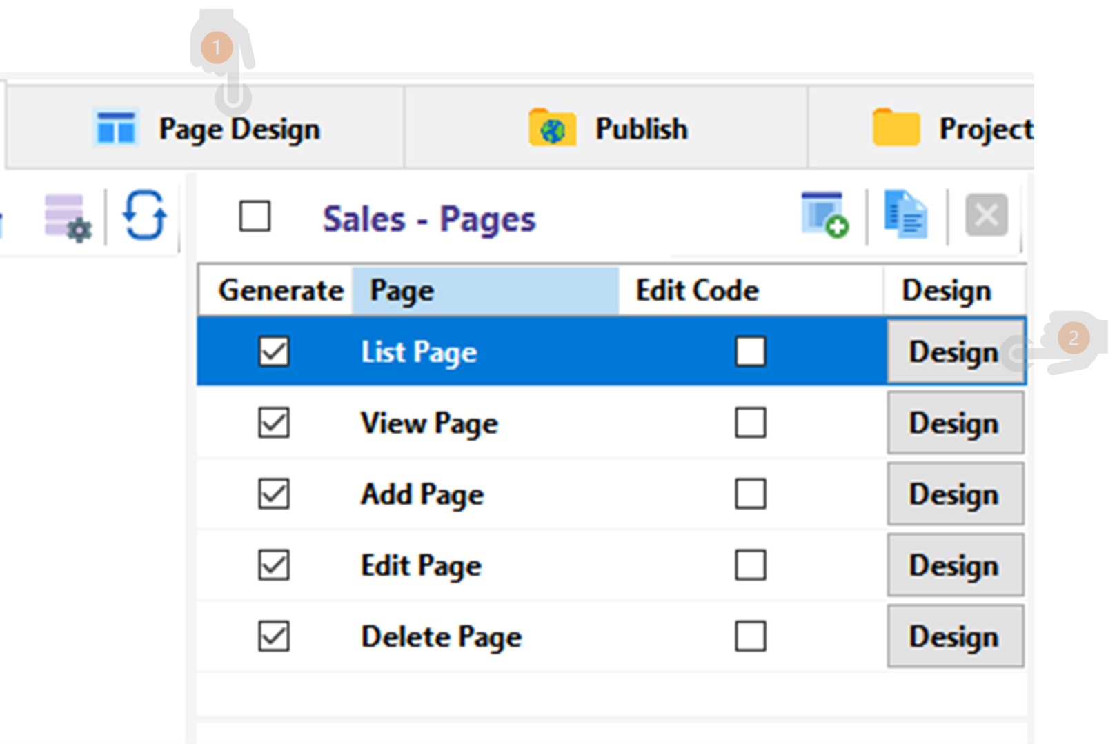
There are two ways to enter Page Design.
- Click on “Page Design” tab.
- Click on the direct access button to the design of the selected page.
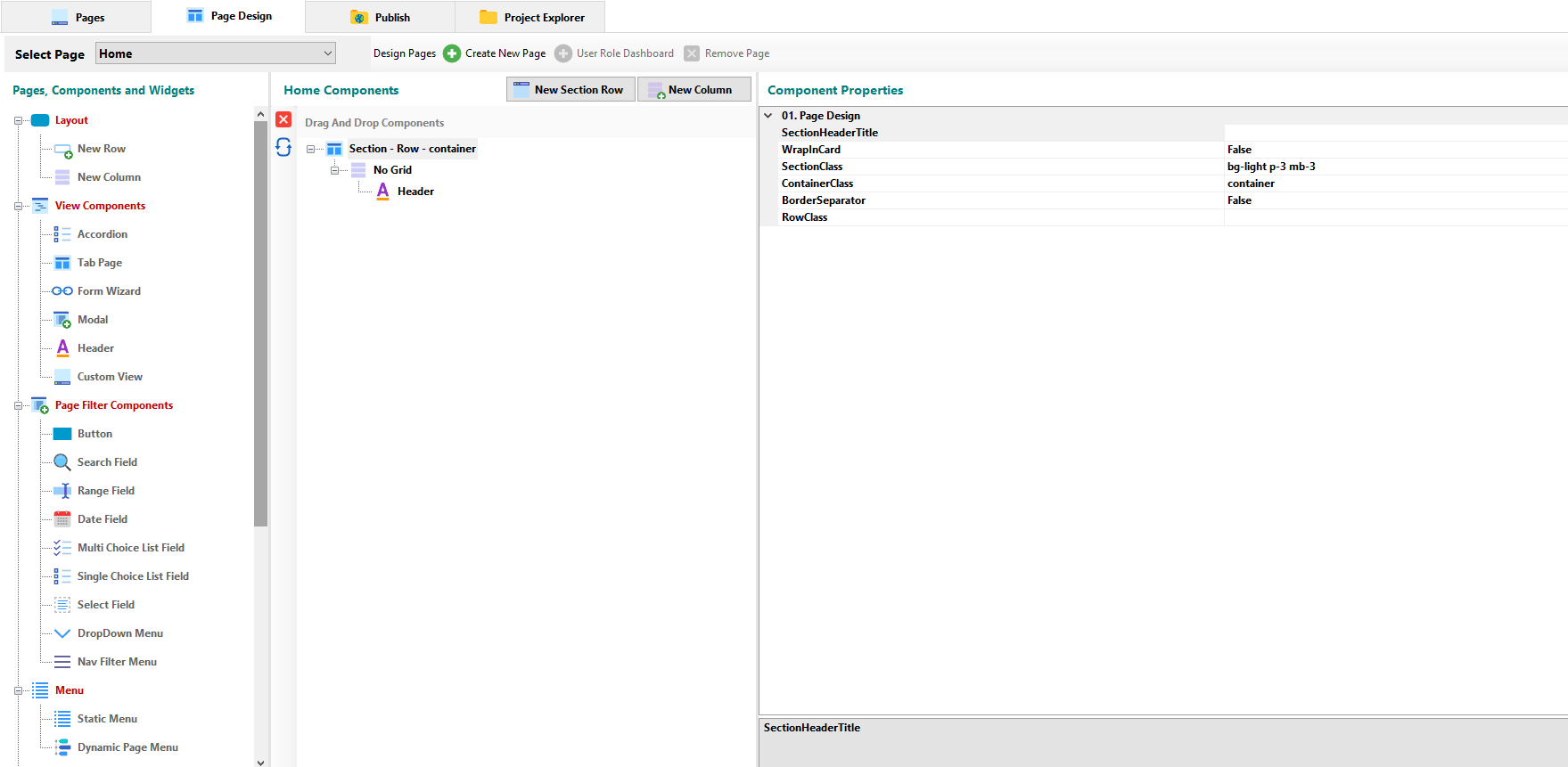
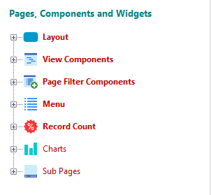
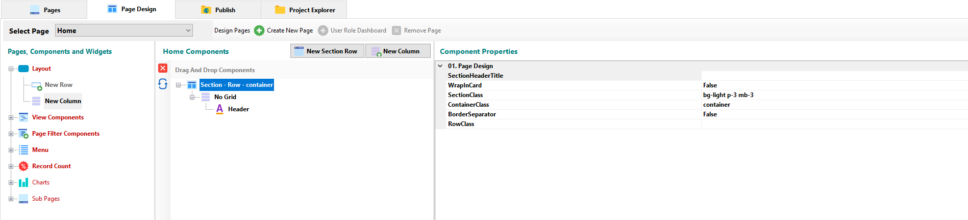
¶ Pages, Components and Widgets
¶ Layout Components
¶ Row Component
The Row component is a wrapper for columns. In Bootstrap, the “row” class is used mainly to hold columns in it. Use it to create horizontal groups of columns.
¶ Component Properties
¶ 01 Page Design
- SectionHeaderTitle: Allows you to set the title for a row.
- WrapInCard: In Bootstrap, a card is a flexible and extensible content container. The option allows you to specify if the row will be contained in the Card element.
- SectionClass: You can specify a bootstrap class to set the background, text color, padding, and so on. or create and specify your own class for the section.
- ContainerClass: You can specify a bootstrap class to set the background, text color, padding, and so on. or create and specify your own class for the container.
- BorderSeparator: Indicates whether a border will be present in the page view.
- RowClass: You can specify a bootstrap class to set the background, text color, padding, and so on. or create and specify your own class for the Row.
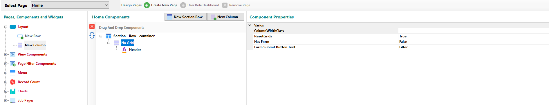
¶ Column Component
The Column component in Bootstrap is a class that indicate the number of columns you’d like to use out of the possible 12 per row. In the Grid System of Bootstrap, content must be placed within columns and only columns may be immediate children of rows
¶ Component Properties
¶ Various
- ColumnWidthClass: You can use Bootstrap classes to set the width of a 12 possible columns per row.
- ResetGrids: You can specify if grids are reset in bootstrap.
- Has Form: Allows you to specify if the page contains a form to enable the submit button.
- Form Submit Button Text: If the page contains a form, you can set the name of the submit button.
¶ View Components
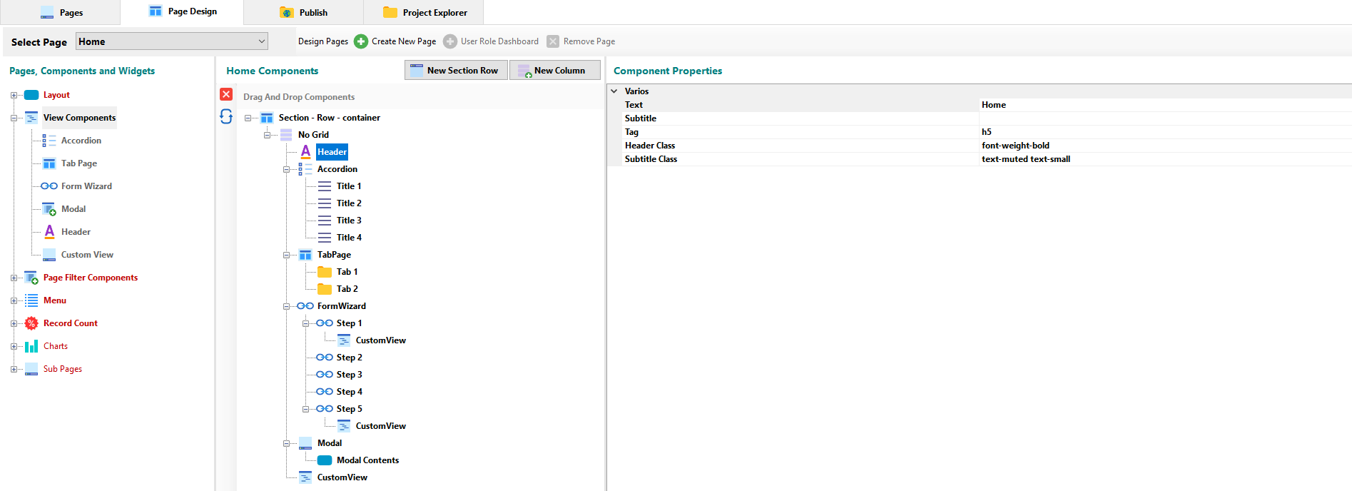
¶ Header Component
¶ Component Properties
¶ Various
- Text: You can specify the title that appears in the page view.
- Subtittle: You can set the subtitle that appears in the page view.
- Tag: There are six types of titles in bootstrap. Here you can select one of them.
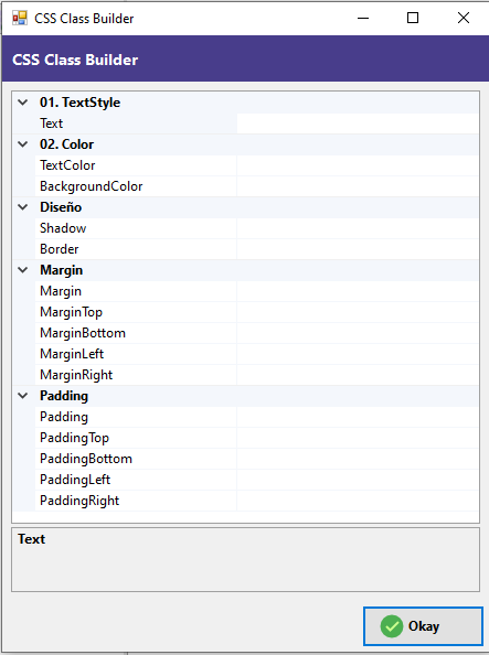
- Header Class: You can set the text style, color, margins and padding for the title component in a practical interface with the CSS Class Builder.
- Subtitle Class: You can set the text style, color, margins and padding for the subtitle.
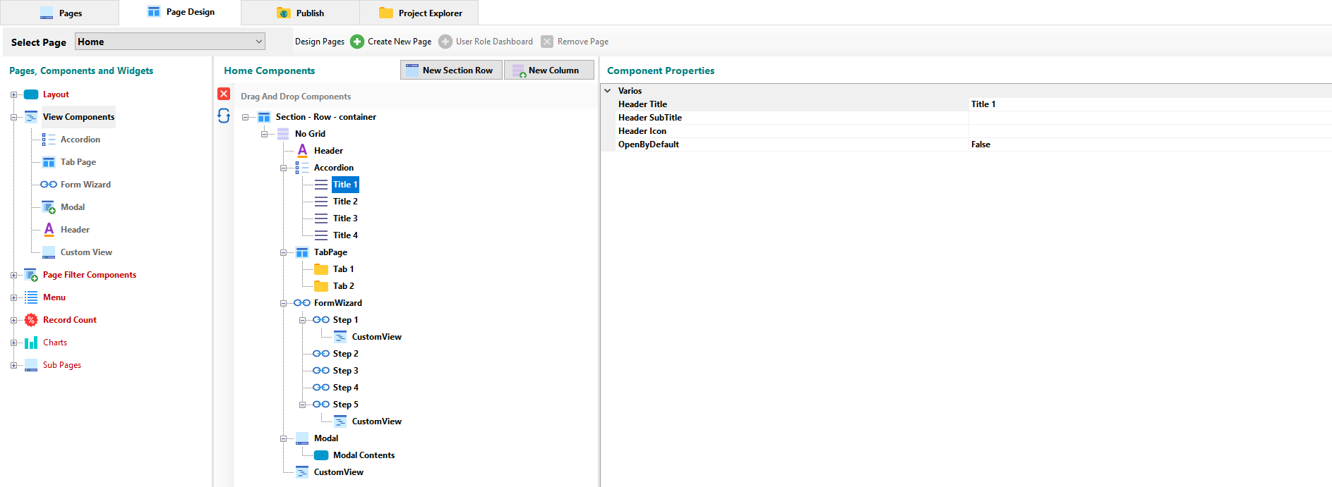
¶ Accordion Component
The accordion component organizes content within collapsable items. Allows to display only one collapsed item at a time.
¶ Component Properties
¶ Various
- Header Title: You can set the title of the accordion tab.
- Header Subtittle: You can set the subtitle of the accordion tab.
- Header icon: You can set an icon for the header title.
- OpenByDefault: When set to True, displays the content of a particular Accordion tab when the page loads.
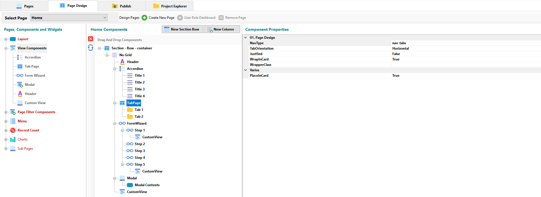
¶ TabPage Component
In the same way as the accordion component, the tab component allows you to organize content in windows.
¶ Component Properties
¶ 01 - Page Design
- NavType: You can set if the nav-bar view will be by pills or tabs.
- TabOrientation: Can be set to Horizontal, Horizontal End, Horizontal Center, Vertical or Vertical End.
- Justified: Allows to establish if the titles of the tabs will be justified in the view of the page.
- WrapInCard: The option allows you to specify if the component will be contained in the Card element.
- WrapperClass: You can set the text style, color, margins and padding for the Tab component in a practical interface with the CSS Class Builder.
¶ Various
- PlaceInCard: You can set if the component will be contained in the Card element.
¶ Tab Component Properties
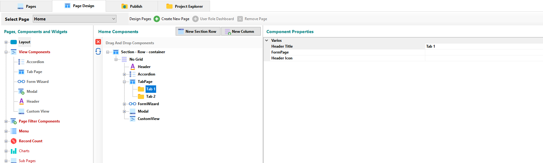
¶ Various
- Header Title: You can set the title of the tab.
- FormPage: You can specify which page will be included in the tab view.
- Header icon: You can set an icon for the tab.
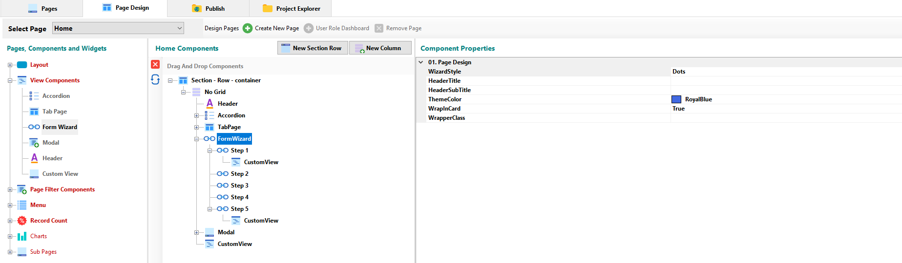
¶ FormWizard Component
The form wizard is a user interface that allows users to achieve a goal through a series of steps.
¶ Component Properties
¶ 01 - Page Design
- WizardStyle: There are three predefined styles that can be used as a choice: dots, circles and arrows.
- Header Title: You can set the title for the form wizard.
- Header Subtittle: You can set the subtitle for the form wizard.
- ThemeColor: You can choose the color for the theme that will be applied to the form wizard.
- WrapInCard: The option allows you to specify if the component will be contained in the Card element.
- WrapperClass: You can set the text style, color, margins and padding for the component through the CSS Class Builder.
¶ Step Component Properties
- Header Title: You can set the title for the step tab of the form wizard.
- Header Subtittle: You can set the subtitle for the step tab of the form wizard.
- FormPage: You can specify which page will be included in the step view.
- Header icon: You can set an icon for the step tab.
- PreviousButtonText: Here you can set a caption for the button that the component includes to access the previous step.
- NextButtonText: Here you can set a caption for the button that the component includes to access the next step.
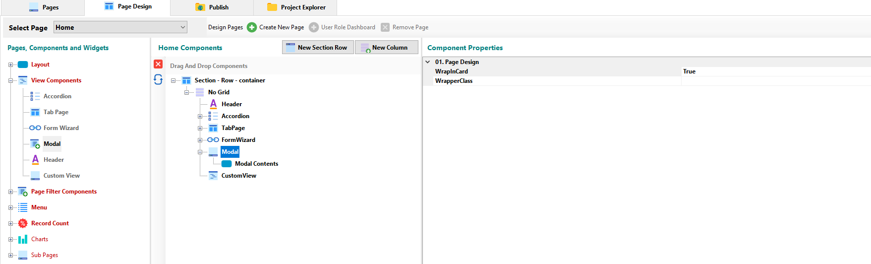
¶ Modal Component
The modal component provides an interface to create dialogs, including forms.
¶ Component Properties
¶ 01 - Page Design
- WrapInCard: The option allows you to specify if the component will be contained in the Card element.
- WrapperClass: You can set the text style, color, margins and padding for the component through the CSS Class Builder.
¶ Modal Contents Component Properties
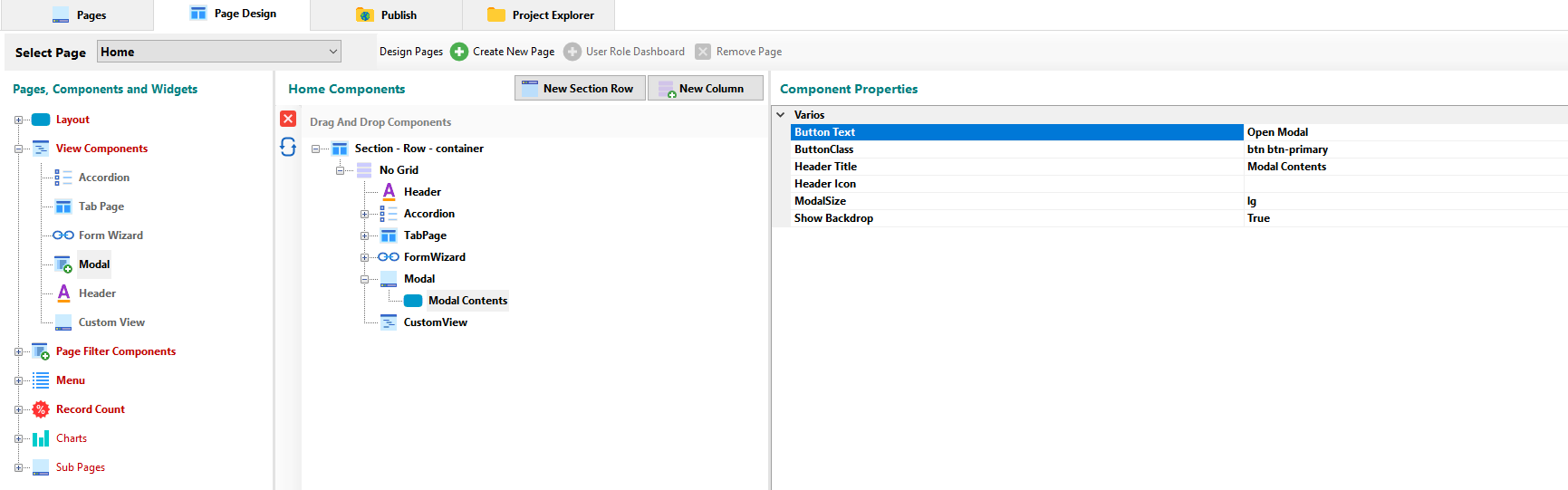
¶ Various
- Button Text: You can set the caption for the modal button.
- ButtonClass: Bootstrap provides several classes for styling buttons. Here you can specify one of these or your own.
- Header Title: You can set the title for the modal window.
- Header icon: You can set an icon for the title of the modal window.
- ModalSize: You can specify a bootstrap class to set the size of the modal window.
- Show Backdrop: By default the system dulls the background to give emphasis to the modal window, you can deactivate the option through this property.
¶ Page Filter Components
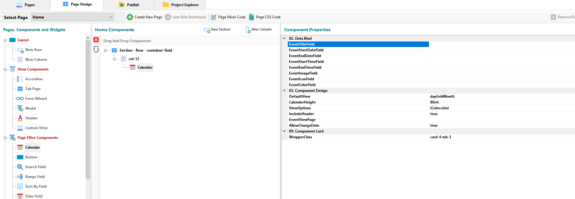
¶ Calender Component
Allows you to insert a Calendar.
¶ Component Properties
¶ 02 - Data Bind
- EventTittleField: Allows you to select the field that contains the title of the component.
- EventStartDateField: Allows you to select the field that will be used as the Start Date for the calendar.
- EventEndDateField: Allows you to select the field that will be used as the End Date for the calendar.
- EventStartTimeField: Allows you to select the field that will be used as the Start Time of the calendar.
- EventEndTimeField: Allows you to select the field that will be used as the End Time of the calendar.
- EventImageField: Allows you to select the field that contains the image to be used by the calendar.
- EventIconField: Allows you to select the field that contains the icon to be used by the Calendar.
- EventColorField: Allows you to select the field that contains the color to be used by the Calendar.
¶ 03 - Component Design
- DefaultView: You can set a default view from drop down list.
- CalenderHeight: You can set the height of the component.
- ViewOptions: In the modal window you can select the available views as well as the names assigned to them.
- IncludeHeader: You can set whether or not the component will have a header.
- EventViewPage: You can select the page containing the calendar events.
- AllowChangeDate: Set it to True to allow the user to change the event date.
¶ 09 - Component Card
- WrapperClass: You can stylize the graphic through the CSS Class Builder.
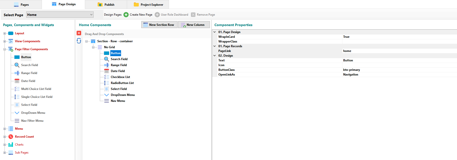
¶ Button Component
Buttons allow to link to a specific page.
¶ Component Properties
¶ 01 - Page Design
- WrapInCard: The option allows you to specify if the component will be contained in the Card element.
- WrapperClass: You can set the text style, color, margins and padding for the component through the CSS Class Builder.
¶ 01 - Page Records
- PageLink: You can set the page to link.
¶ 02 - Design
- Text: You can set the caption for the button.
- icon: You can set an icon for the caption of the button.
- ButtonClass: Bootstrap provides several classes for styling buttons. Here you can specify one of these or your own.
- OpenAsLink: You can specify whether the button will redirect to the page in the navigation way, as an ajax modal window or inserted in the same view.
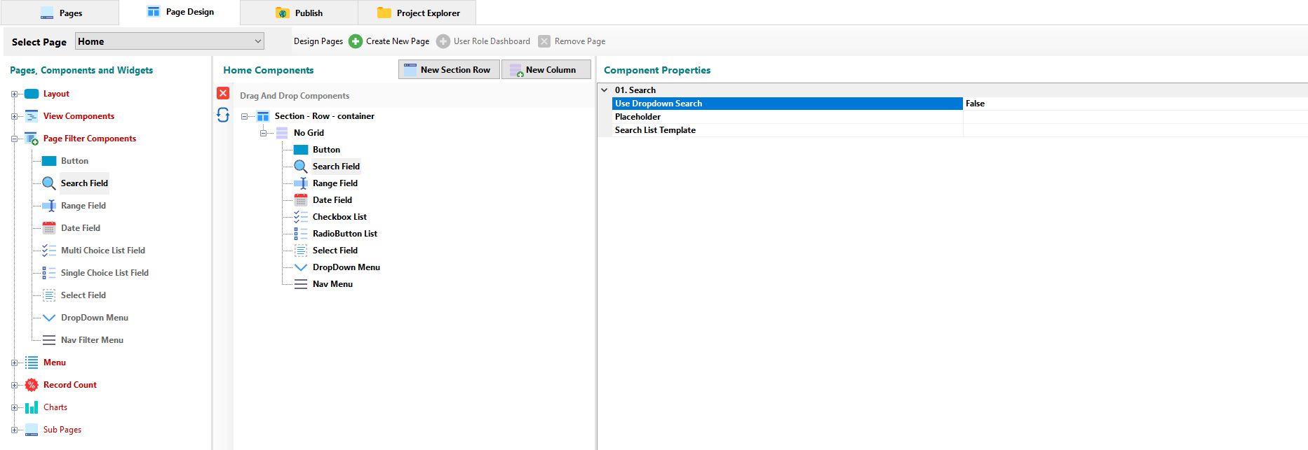
¶ Search Field Component
Add a search field on the page, allowing the user to make certain queries.
¶ Component Properties
¶ 01 - Search
- Use Dropdown Search: Enables drop-down search in the component.
- Placeholder: Allows you to set the text label placed inside a field of a form.
- Search List Template: Through the code editor, it allows to customize the ajax search format.
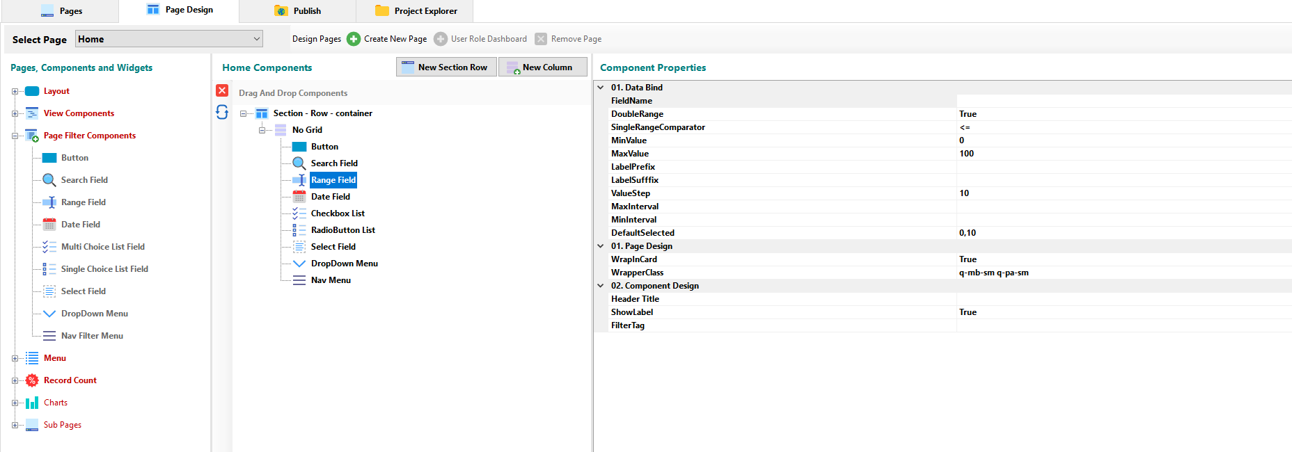
¶ Range Field Component
Add a Slide Range control to the page to filter the data by the range established in it.
¶ Component Properties
¶ 01 - Data Bind
- FieldName: The property allows select the field by which the data will be filtered.
- DoubleRange: Set a double slider for the component to filter data through two variables.
- SingleRangeComparator: You can define comparison operator for data filtering.
- MinValue: Allows you to set the minimum value of the range component.
- MaxValue: Allows you to set the maximum value of the range component.
- LabelPrefix: It allows to indicate a prefix for the label of the minimum and maximum values.
- LabelSuffix: It allows to indicate a suffix for the label of the minimum and maximum values.
- ValueStep: Allows to set the jump between values of the established range.
- MaxInterval: Allows you to set the maximum range that is allowed between the minimum and maximum values.
- MinInterval: Allows you to set the minimum range that is allowed between the minimum and maximum values.
- DefaultSelected: Allows you to set the default value of the sliding indicator.
¶ 01 - Page Design
- WrapInCard: The option allows you to specify if the component will be contained in the Card element.
- WrapperClass: You can set the text style, color, margins and padding for the component through the CSS Class Builder.
¶ 02 - Component Design
- Header Title: You can set the title for the componente container.
- ShowLabel: If set to TRUE, the component’s numerical scale will be visible.
- FilterTag: Let you display the title for the currente filter result.
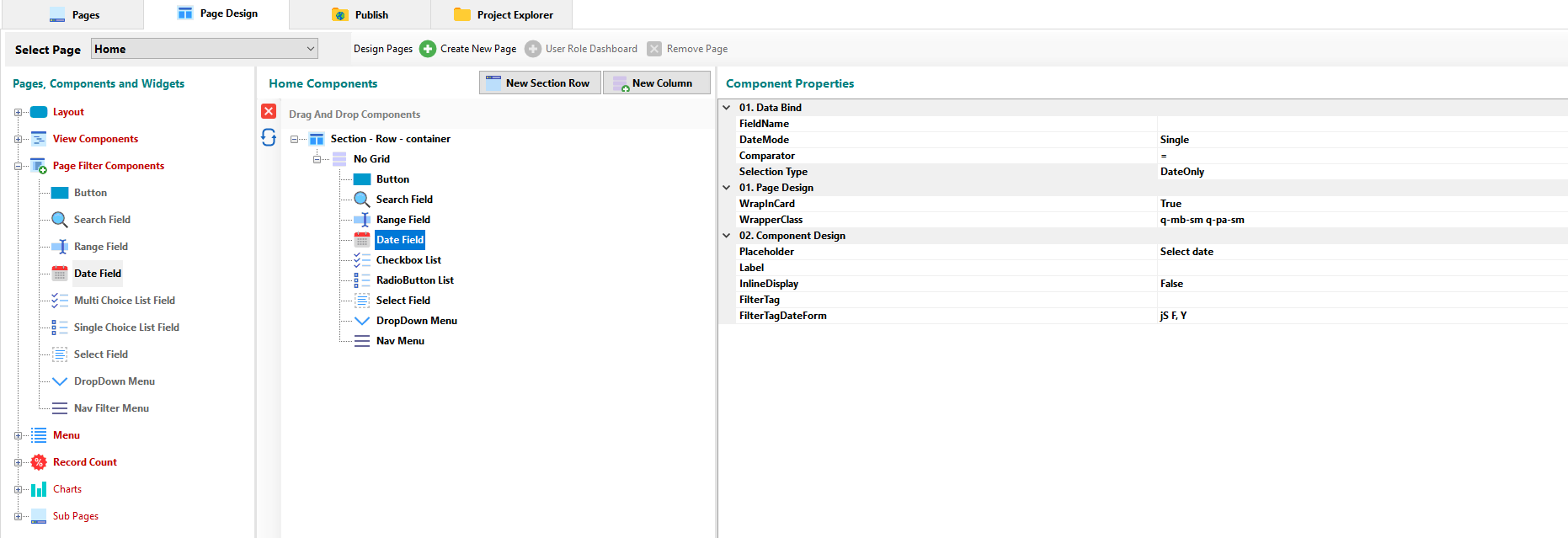
¶ Date Field Component
Adds a date picker to the view to filter data by the selected date.
¶ Component Properties
¶ 01 - Data Bind
- FieldName: Allows select the field by which the data will be filtered.
- DateMode: You can set a single date picker, multiple date picker or a range date picker.
- Comparator: You can define comparison operator for data filtering.
- Selection Type: You can select if the format for the date picker will include time or one of them.
¶ 01 - Page Design
- WrapInCard: The option allows you to specify if the component will be contained in the Card element.
- WrapperClass: You can set the text style, color, margins and padding for the component through the CSS Class Builder.
¶ 02 - Component Design
- Placeholder: Allows you to set the text label placed inside the component.
- Label: You can set the title for the componente container.
- InLineDisplay: Allows to make the date picker permanently visible.
- FilterTag: Let you display the title for the currente filter result.
- FilterTagDateForm: Let you set the date picker format.
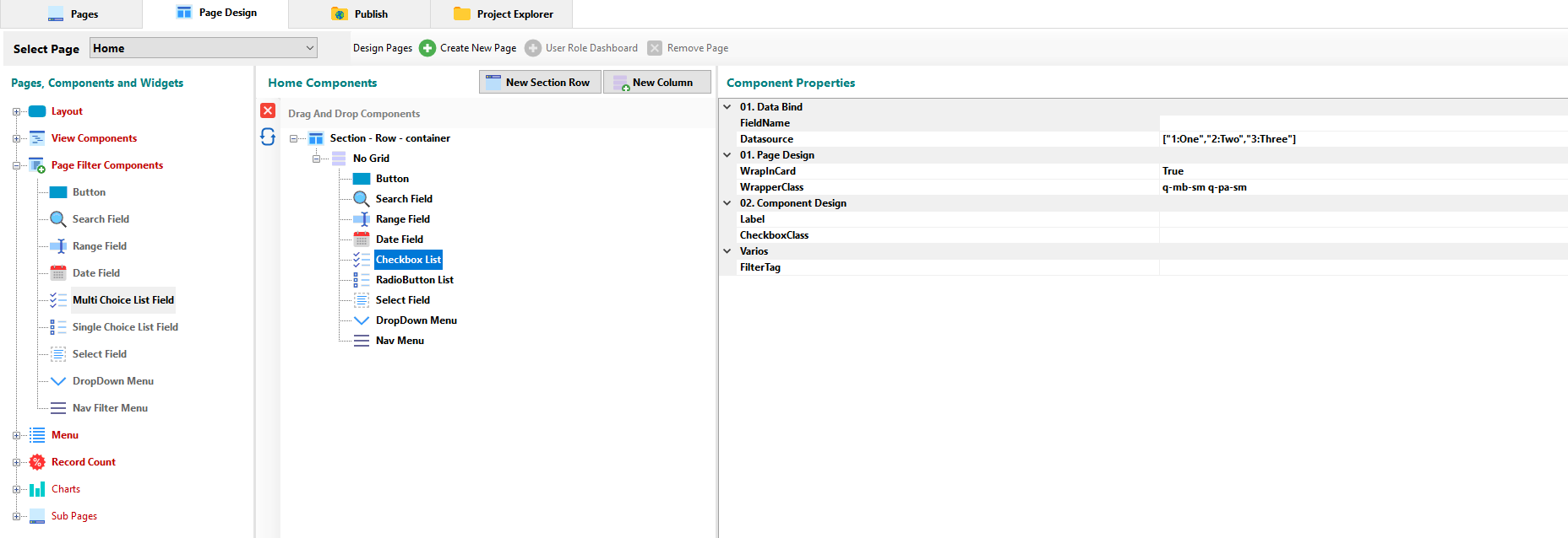
¶ Multi Choice List Field Component
Adds a list of checkboxes to the view to filter the data by the selected checkbox.
¶ Component Properties
¶ 01 - Data Bind
- FieldName: The property allows select the field by which the data will be filtered.
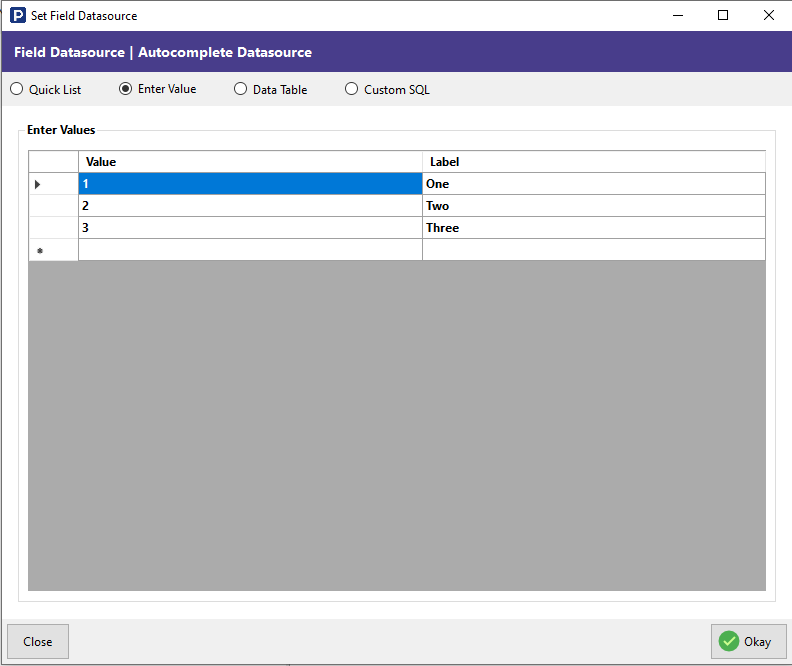
- DataSource: Opens a modal window where you can establish the source of the data for filtering. You can access to a Quick List, define the values, select values through a table or or build your own sql statement
¶ 01 - Page Design
- WrapInCard: The option allows you to specify if the component will be contained in the Card element.
- WrapperClass: You can set the text style, color, margins and padding for the component through the CSS Class Builder.
¶ 02 - Component Design
- Label: You can set the title for the componente container.
- CheckboxClass: You can customize the view of the checkboxes through the styles offered by the classes in bootstrap.
¶ Various
- FilterTag: Let you display the title for the currente filter result.
¶ Single Choice List Field Component
Adds a list of radio buttons to the view to filter the data by the selected checkbox.
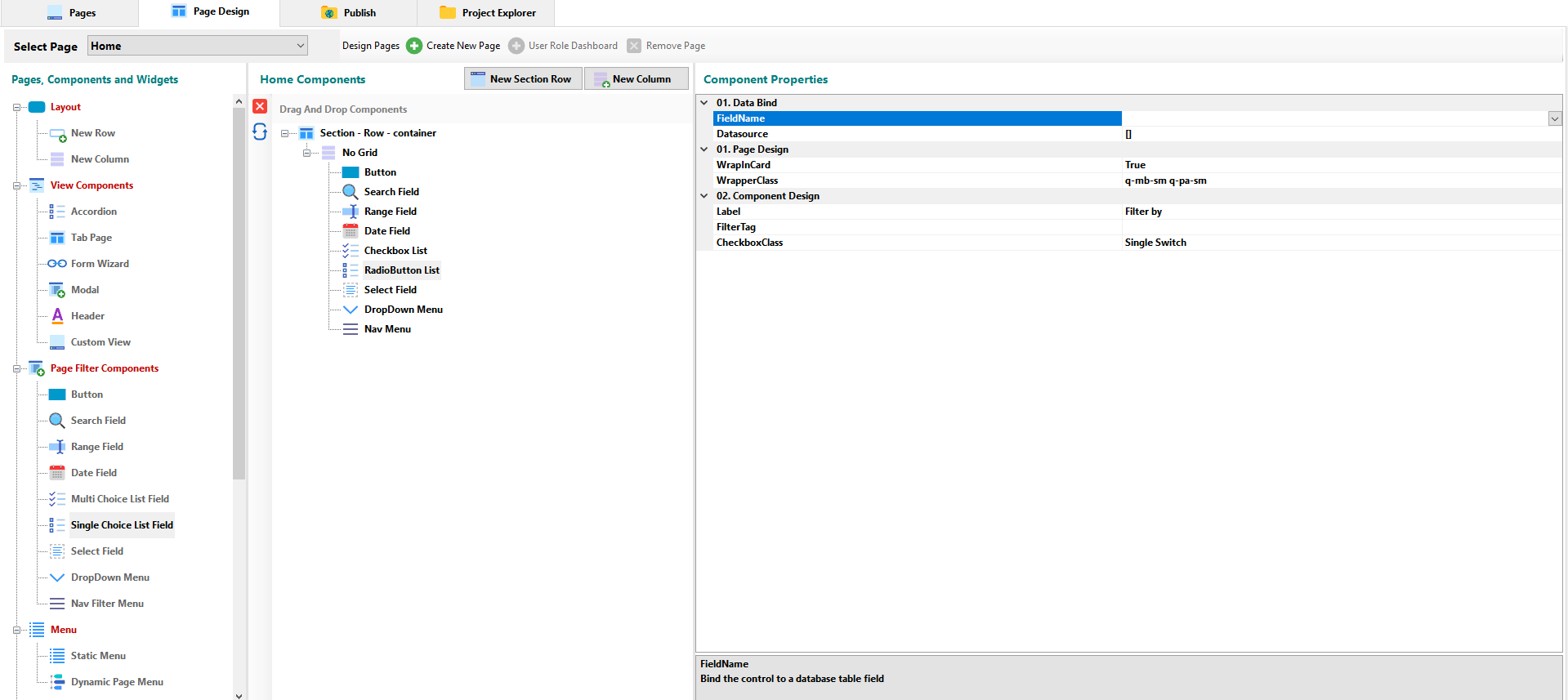
¶ Component Properties
¶ 01 - Data Bind
- FieldName: The property allows select the field by which the data will be filtered.
- DataSource: Opens a modal window where you can establish the source of the data for filtering. You can access to a Quick List, define the values, select values through a table or or build your own sql statement.
¶ 01 - Page Design
- WrapInCard: The option allows you to specify if the component will be contained in the Card element.
- WrapperClass: You can set the text style, color, margins and padding for the component through the CSS Class Builder.
¶ 02 - Component Design
- Label: You can set the title for the componente container.
- FilterTag: Let you display the title for the currente filter result.
- CheckboxClass: You can customize the view of the radiobuttons (Custom Vertical, Custom Inline, Normal Inline, Normal Vertical, Button Group, Single Switch).
¶ Select Field Component
Add a drop-down list to the view to filter the data by the selected item.
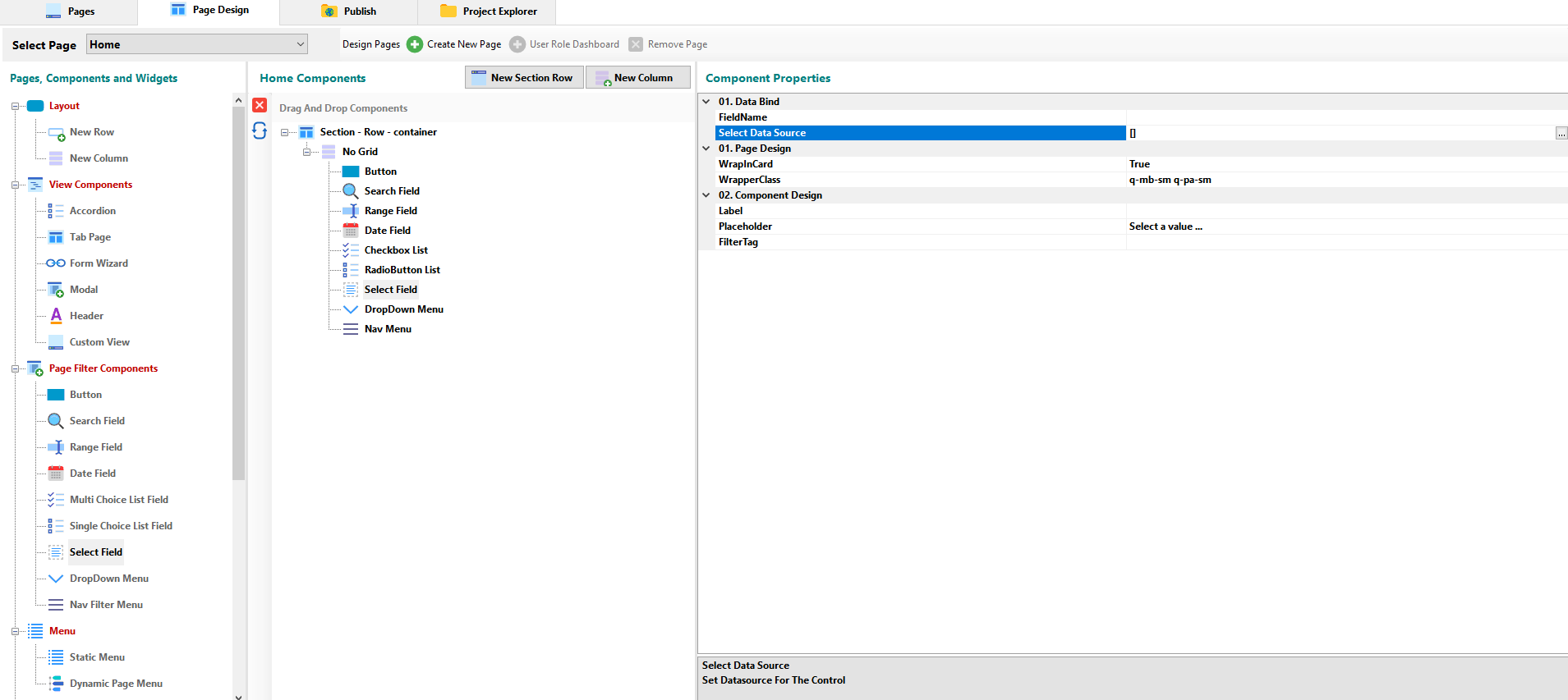
¶ Component Properties
¶ 01 - Data Bind
- FieldName: The property allows select the field by which the data will be filtered.
- DataSource: Opens a modal window where you can establish the source of the data for filtering. You can access to a Quick List, define the values, select values through a table or or build your own sql statement.
¶ 01 - Page Design
- WrapInCard: The option allows you to specify if the component will be contained in the Card element.
- WrapperClass: You can set the text style, color, margins and padding for the component through the CSS Class Builder.
¶ 02 - Component Design
- Label: You can set the title for the componente container.
- Placeholder: Here you can enter the placeholder to guide the selection in the component.
- FilterTag: Let you display the title for the currente filter result.
¶ DropDown Menu Component
Add a drop-down button to the view to filter the data by the selected item.
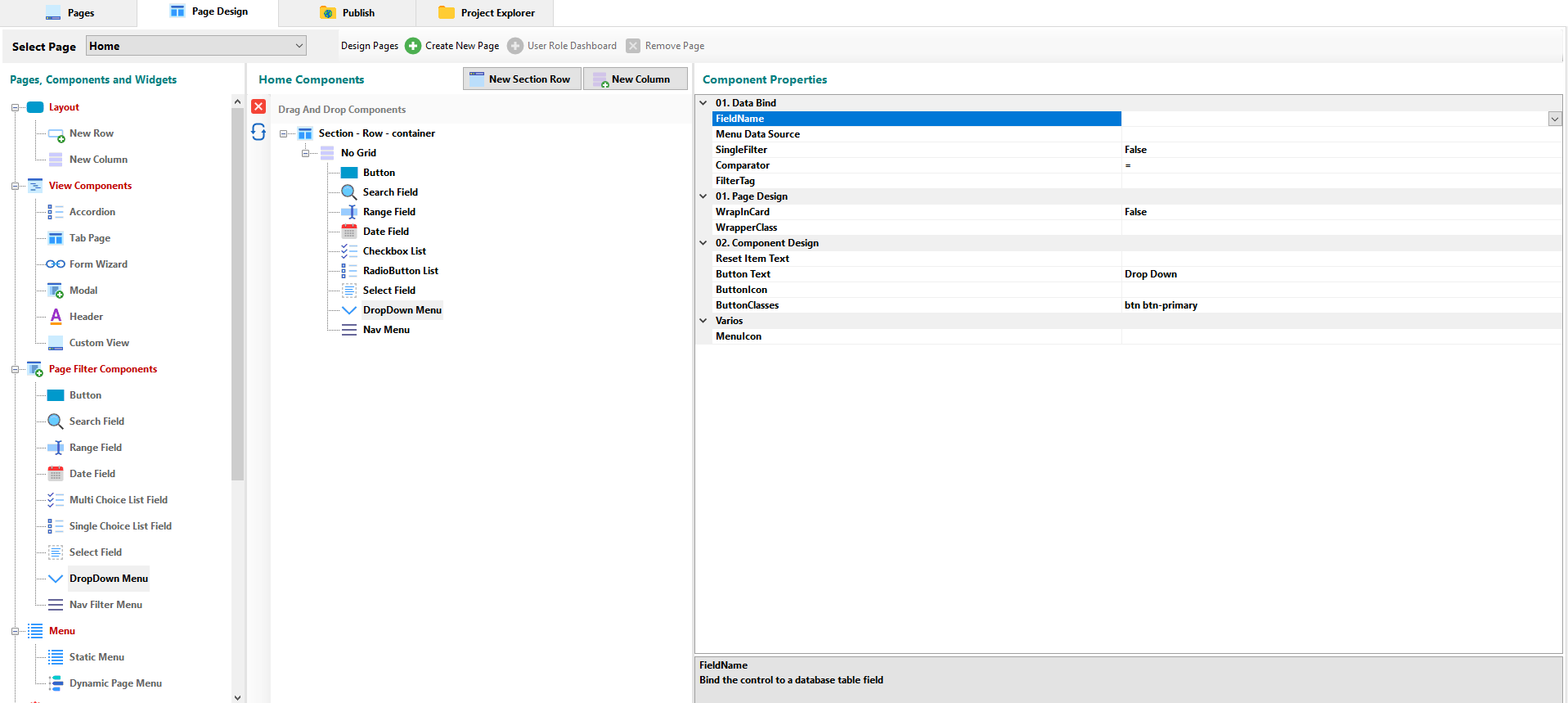
¶ Component Properties
¶ 01 - Data Bind
- FieldName: The property allows select the field by which the data will be filtered.
- Menu Data Source: Opens a modal window where you can establish the source of the data for filtering. You can access to a Quick List, define the values, select values through a table or or build your own sql statement.
- SingleFilter: Allows to enable the selection of one or several items at the same time.
- Comparator; You can define comparison operator for data filtering.
- FilterTag: Let you display the title for the currente filter result.
¶ 01 - Page Design
- WrapInCard: The option allows you to specify if the component will be contained in the Card element.
- WrapperClass: You can set the text style, color, margins and padding for the component through the CSS Class Builder.
¶ 02 - Component Design
- Reset Item Text: Allows you to set the text of the item to reset the component.
- Button Text: Lets you set the text of the drop-down button.
- Button Icon: Lets you set the icon for the drop-down button.
- Button Classes: Bootstrap provides several classes for styling buttons. Here you can specify one of these or your own.
¶ Varios
- Menu Icon: Lets you set a icon for the drop-down menu.
¶ Nav Filter Menu Component
Add a filter menu to the view to filter the data by the selected item.
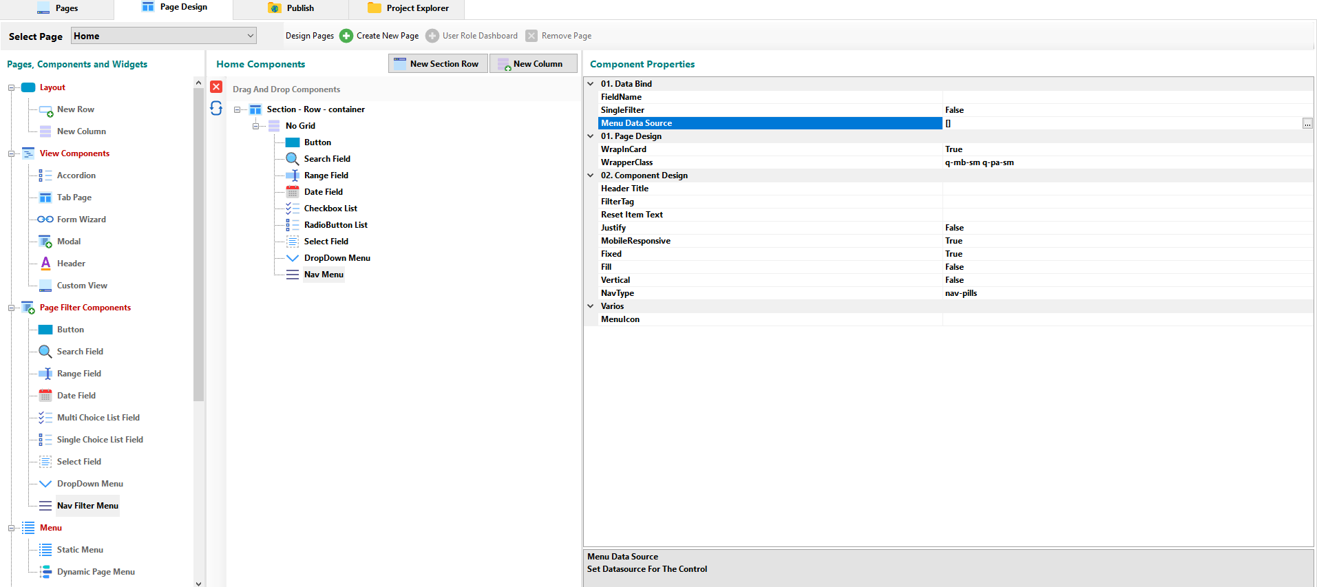
¶ Component Properties
¶ 01 - Data Bind
- FieldName: The property allows select the field by which the data will be filtered.
- SingleFilter: Allows to enable the selection of one or several items at the same time.
- Menu Data Source: Opens a modal window where you can establish the source of the data for filtering. You can access to a Quick List, define the values, select values through a table or or build your own sql statement.
¶ 01 - Page Design
- WrapInCard: The option allows you to specify if the component will be contained in the Card element.
- WrapperClass: You can set the text style, color, margins and padding for the component through the CSS Class Builder.
¶ 02 - Component Design
- Header Tittle: Allows you to set the title of the filter menu.
- FilterTag: Lets you display the title for the currente filter result.
- Reset Item Text: Allows you to set the text of the item to reset the component.
- Justify: Allows you to justify the items in the whole width of the menu.
- **Mobile Responsibe: Allows you to set if the component will be mobile responsive.
- Fixed: Allows you to set the fixed property to the layout of the view.
- Fill: Allows you to fill the component area with the filter menu items.
- Vertical: Lets you set the orientation of the component.
- NavType: Here you can set the style of the navigation items (nav-pills or nav-tabs)
¶ Varios
- Menu Icon: Lets you set an icon for the component.
¶ Menu Components
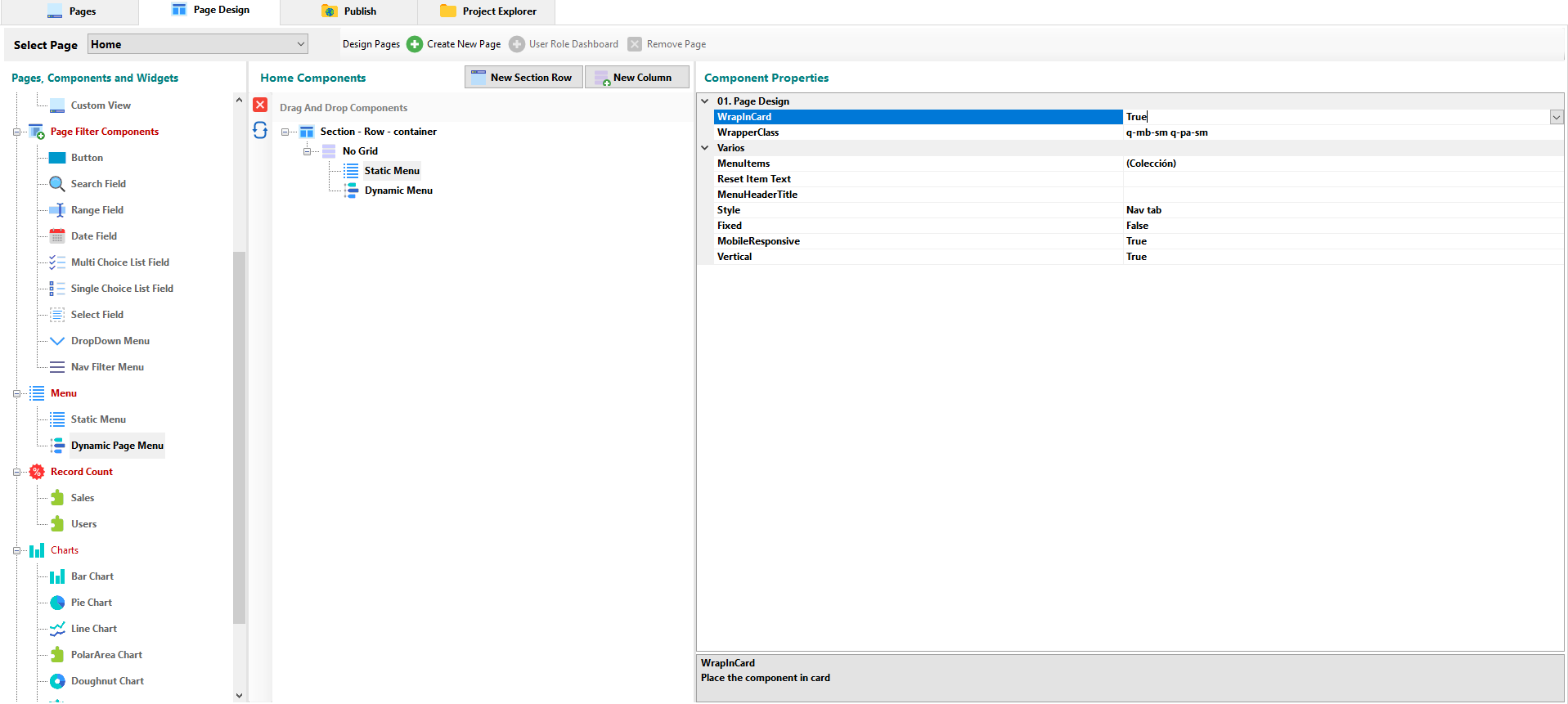
¶ Static Menu Component
Add a Static Menu component to the view.
¶ Component Properties
¶ 01 - Page Design
- WrapInCard: The option allows you to specify if the component will be contained in the Card element.
- WrapperClass: You can set the text style, color, margins and padding for the component through the CSS Class Builder.
¶ Varios
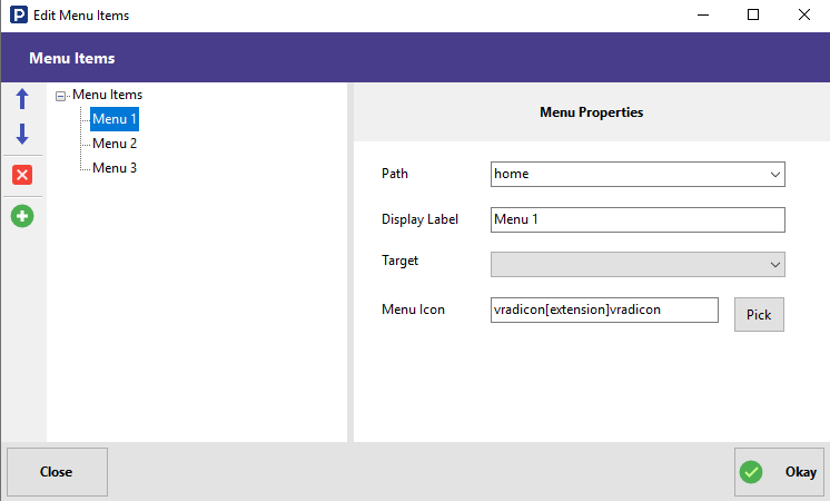
- MenuItems: Opens a modal window where you can manage the menu items.
- Reset Item Text: Allows you to set the text of the item to reset the component.
- Menu Header Tittle: Allows you to set the title of the Static Menu component.
- Style: You can choose between pills or a tabular menu.
- Fixed: Allows you to set the fixed property to the layout of the view.
- **Mobile Responsibe: Allows you to set if the component will be mobile responsive.
- Vertical: Lets you set the orientation of the component.
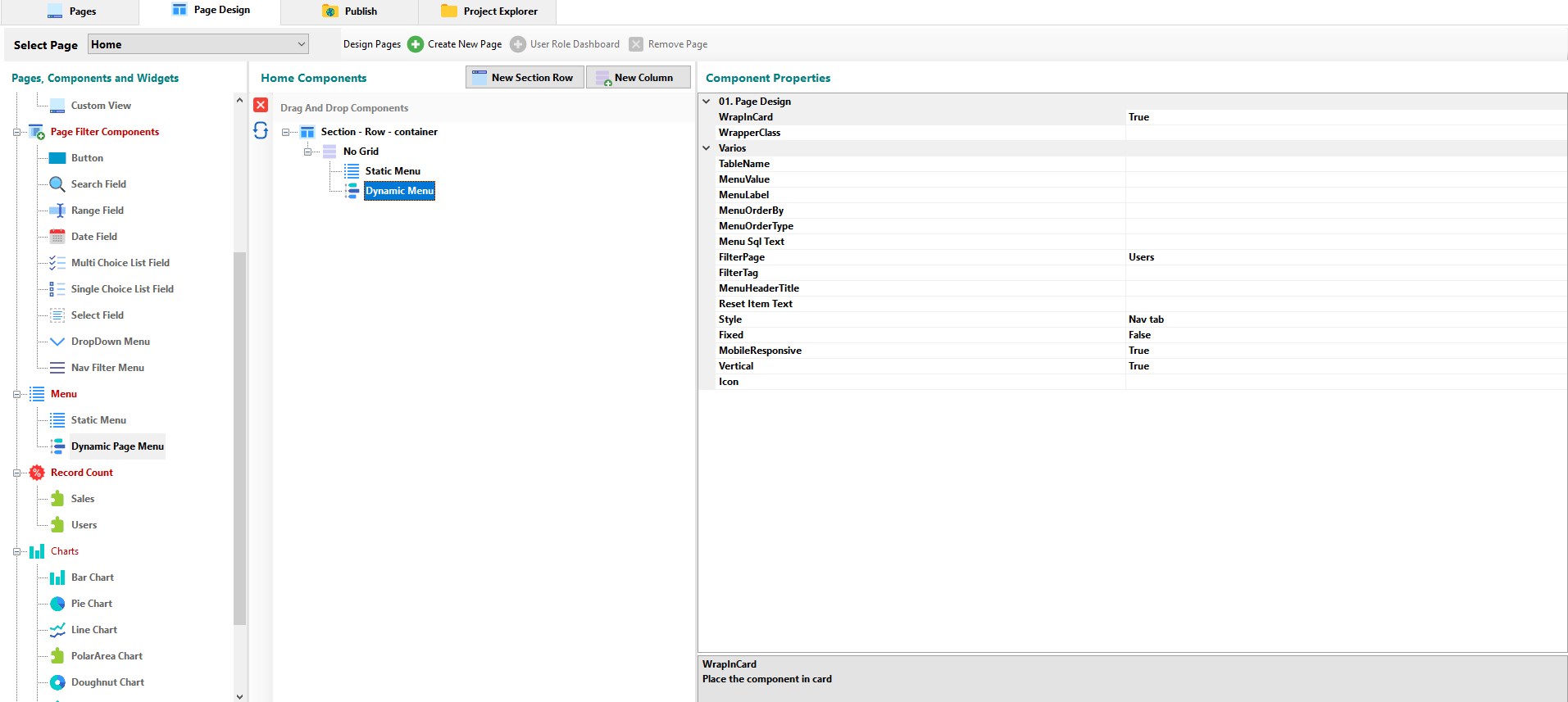
¶ Dynamic Page Menu Component
Add a Dynamic Menu component to the view.
¶ Component Properties
¶ 01 - Page Design
- WrapInCard: The option allows you to specify if the component will be contained in the Card element.
- WrapperClass: You can set the text style, color, margins and padding for the component through the CSS Class Builder.
¶ Varios
- TableName: Allows you to select the table to which the filters will be applied through the component.
- MenuValue: Once the table is selected, it allows selecting the field from which the dynamic menu items will be extracted.
- MenuLabel: Once the table is selected, it allows selecting the field from which the dynamic menu labels will be extracted,
- MenuOrderBy: Allows you to select the field by which the component performs the sort.
- MenuOrderType: You can select an ASC order or a DESC order.
- Menu Sql Text: Opens a modal window where you can establish the source of the data for the component. You can access to a Quick List, define the values, select values through a table or or build your own sql statement.
- FilterPage: Allows you to select the page that will be filtered through the component.
- FilterTag: Lets you display the title for the currente filter result.
- MenuHeaderTittle: Allows you to set the title of the Dynamic Menu component.
- Reset Item Text: Allows you to set the text of the item to reset the component.
- Style: You can choose between pills or a tabular menu.
- Fixed: Allows you to set the fixed property to the layout of the view.
- **Mobile Responsibe: Allows you to set if the component will be mobile responsive.
- Vertical: Let you set the orientation of the component.
- Icon: Lets you set an icon for the component.
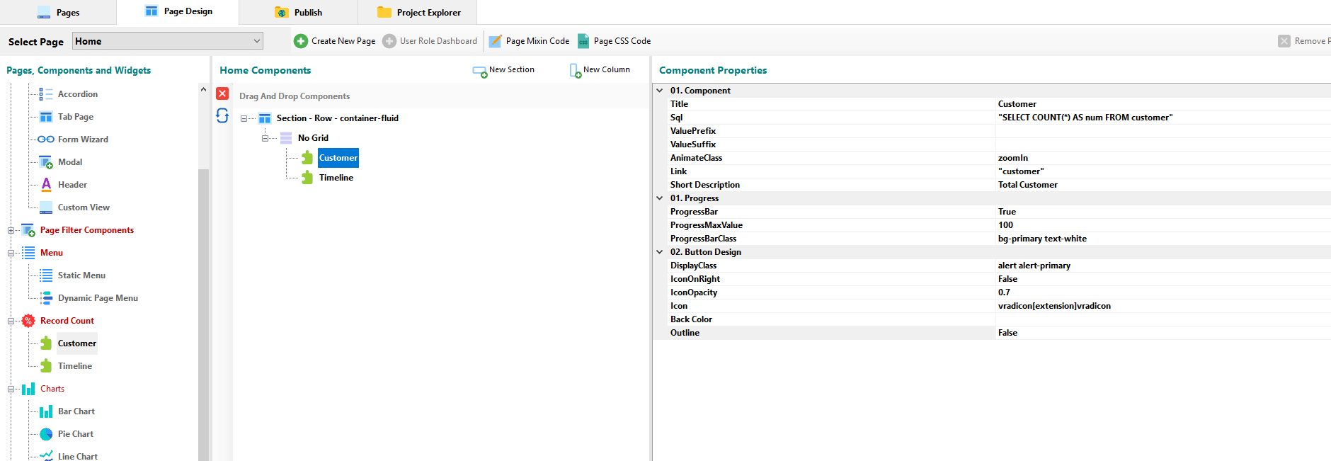
¶ Record Count Component
For each table in your DB, RadSystems automatically creates a component that counts the number of records in the table. In a table with customers, for example, by default it will generate an sql query to display the number of customers registered in the table.
¶ Component Properties
¶ 01 - Component
- Tittle: You can set the title of the component.
- Sql: Opens a modal window where you can build your own sql statement.
- ValuePrefix: You can set a prefix for the displayed data.
- ValueSuffix: You can set a suffix for the displayed data.
- AnimateClass: Allows you to choose between the different types of animation for the presentation of the data.
- Link: Allows you to specify the view to which it will be redirected when clicking on the component.
- Short Description: Allows you to enter a small description for the presentation of the data
¶ 01 - Progress
- ProgressBar: Indicates to the system if a lower progress bar is displayed on the control.
- ProgressMaxValue: You can define the maximum value that the progress bar will take as a parameter.
- ProgressBarClass: You can define the style of the progress bar between the options offered by bootstrap.
¶ 01 - Button Design
- DisplayClass: The control is shown by default as a button to which you can add one of the bootstrap styles or one defined by yourself.
- IconOnRight: You can change the place of the icon from right to left.
- IconOpacity: You can set the transparency level of the control as a button.
- Icon: Displays a modal window in which you can choose the control icon.
- BackColor: You can set the background color of the control.
- OutLine: You can set whether the control will have the button style only with borders.
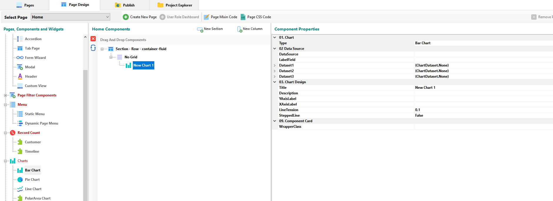
¶ Charts Component
Offers different types of graphs to visualize data.
¶ Bar Chart, Pie Chart, Line Chart, PolarArea Chart, Doughnut Chart, Radar Chart Components
¶ Component Properties
¶ 01 - Chart
- Type: You can select the type of the chart.
¶ 02 - Data Source
- DataSource: Opens a modal window where you can where you can build your own sql query or through the query designer.
- LabelField: Allows you to select the field to be used as the title of the chart.
- DataSet: You can set up to 3 Datasets.
- ValueField: Let you set the field as the value of the dataset.
- Tittle: Let you set the tittle of the dataset.
- BackgroundColor: You can choose the background style from the drop-down list.
- BorderColor: You can choose the border color style from the drop-down list.
- BorderWidth: You can set the border width.
¶ 03 - Chart Design
- Tittle: Here you can set the Tittle of the Chart.
- Description: Allows you to set a description of the Chart.
- YAxisLabel: Here you can set the Chart’s Y-Axis label.
- XAxisLabel: Here you can set the Chart’s X-Axis label.
- LineTension: It allows to smooth the lines of the graph especially to attenuate the peaks of the curves.
- SteppedLine: Let you set if the Chart’s lines will be broken or not.
¶ 09 - Component Card
- WrapperClass: You can stylize the graphic through the CSS Class Builder.
¶ Sub Pages Component
It allows inserting a view of the tables that exist in the project either to list records or view, add, edit a record.
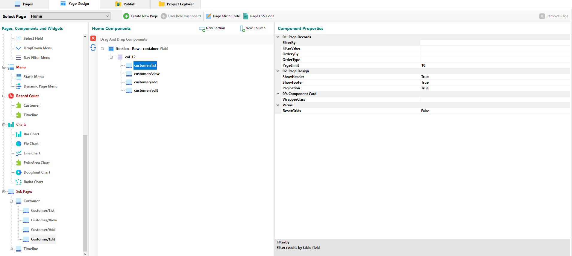
¶ Component Properties
In a List SubPage, you can:
¶ 01 - Page Records
- FilterBy: You can select the field by which the filter will be performed in the list of records.
- FilterValue: You can set the value by which the records will be filtered.
- OrderBy: Allows you to set the field by which the list will be sorted.
- OrderType: It allows to establish if the applied order will be ascending or descending.
- PageLimit: Allows you to set the limit of records displayed in the view.
¶ 02 - Page Design
- ShowHeader: You can set to TRUE to show the component title or to FALSE to hide it.
- ShowFooter: Allows you to set whether or not the footer is displayed.
- Pagination: Allows you to set whether or not the pagination is displayed.
¶ 09 - Component Card
- WrapperClass: You can stylize the graphic through the CSS Class Builder.
¶ Varios
- ResetGrids: Breaks records down into rows to fit pages.
In a View SubPage, you can:
¶ 01 - Page Records
- RecordId: Allows you to indicate the record to view. By default, the primary field is selected through the variable $rec_id.
¶ 09 - Component Card
- WrapperClass: You can stylize the graphic through the CSS Class Builder.
¶ Varios
- ShowHeader: You can set to TRUE to show the component title or to FALSE to hide it.
- ShowFooter: Allows you to set whether or not the footer is displayed.
In a Add SubPage, you can:
¶ 01 - Page Design
- ShowHeader: You can set to TRUE to show the component title or to FALSE to hide it.
¶ 02 - Data Bind
- Field Value Data Bind: In the pop-up window, you can set the Bind Value to link data.
¶ 09 - Component Card
- WrapperClass: You can stylize the graphic through the CSS Class Builder.
In a Edit SubPage, you can:
¶ 01 - Page Records
- RecordId: Allows you to set the record to Edit.
¶ 02 - DataBind
- Field Value Data Bind: In the pop-up window, you can set the Bind Value to link data.
¶ 02 - Page Design
- ShowHeader: You can set to TRUE to show the component title or to FALSE to hide it.
¶ 09 - Component Card
- WrapperClass: You can stylize the graphic through the CSS Class Builder.