¶ Page Display Templates
In RadSystems Studio, the Display Template is the engine that defines the visual structure of your data list. By selecting a template, you apply specific UI classes and layout configurations that are natively compatible with the Frontend Framework (such as Bootstrap or Quasar) you selected during the initial project creation.
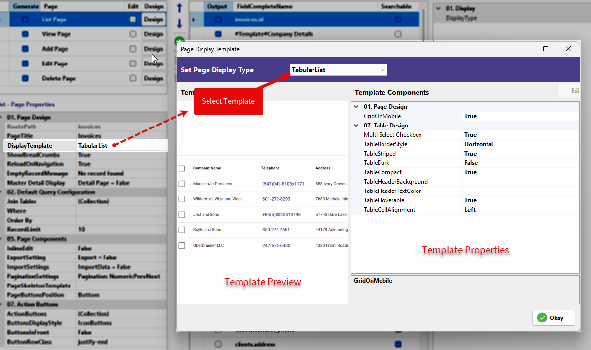
The Set Page Display Type window is your design hub for data presentation. It is divided into three functional areas:
-
Select Template Dropdown: Choose the base layout for your page.
-
Template Preview: A real-time visual representation of how your data will appear.
-
Template Components: A granular property grid where you can configure the layout and styling.
¶ 1. TabularList (Table)
The TabularList is a traditional row-and-column layout. It is the most efficient choice for data-heavy administrative pages.
-
GridOnMobile: When set to True, the table collapses into a grid layout on mobile devices to ensure readability.
-
Multi Select Checkbox: Adds a checkbox to each row, allowing users to select multiple records for bulk actions.
-
TableBorderStyle: Sets the CSS border style for the table (e.g., Horizontal).
-
TableStriped: Toggles alternating background colors for rows to help users track data across the screen.
-
TableDark: Applies a dark theme to the table, assuming your frontend framework supports a dark mode variant.
-
TableCompact: Reduces the padding and spacing within cells to fit more information on a single page.
-
TableHeaderBackground: Allows you to define a specific background color for the header row.
-
TableHeaderTextColor: Allows you to define the text color for the column titles in the header.
-
TableHoverable: Highlights the row currently under the user's mouse cursor for better focus.
-
TableCellAlignment: Defines the default text alignment (Left, Center, or Right) for all cells in the table.
¶ 2. Grid
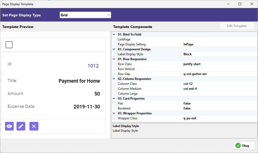
The Grid template displays records as cards. This is highly effective for dashboards where each record contains several key data points.
-
LinkPage: Defines which page the user is directed to when they click on the card (e.g.,
invoices/view). -
Page Display Setting: Controls whether the linked page opens InPage or as a Modal.
-
Label Display Style: Sets how the field labels are positioned relative to their values (e.g., Block).
-
Row Class: Allows you to add custom CSS row classes for layout control.
-
Row Vertical: Defines the vertical alignment of the cards within the row.
-
Row Gap: Sets the spacing between the cards (e.g.,
q-col-gutter-sm). -
Column Class: Sets the default column width.
-
Column Medium: Sets the column width for medium-sized screens (e.g.,
col-md-4). -
Column Large: Sets the column width for large desktop screens.
-
Flat: When True, removes the elevation shadow from the card.
-
Bordered: When True, adds a visible border around each card.
-
Wrapper Class: Allows you to apply global CSS classes to the entire grid container.
¶ 3. ListView
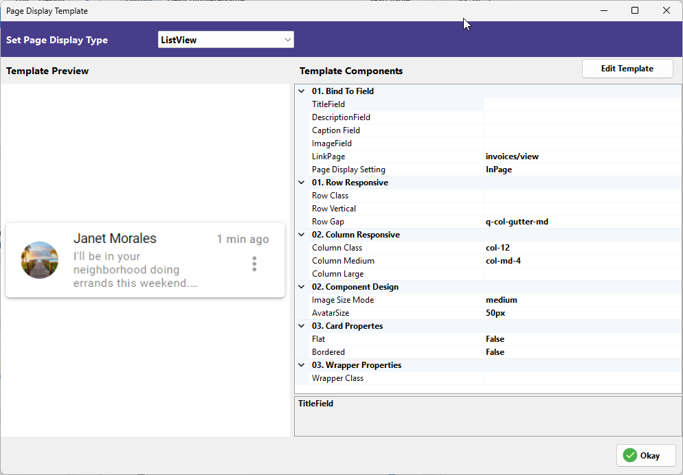
The ListView provides a streamlined, vertically stacked layout, ideal for messaging or notification-style data.
-
TitleField: Bind the primary database field to be used as the main bold title.
-
DescriptionField: Bind the field to be used for the secondary text or body.
-
CaptionField: Bind a field to display a small caption, such as a timestamp.
-
ImageField: Map the database column that contains the URL or path for the record's image.
-
LinkPage: The navigation path for when a record is clicked.
-
Page Display Setting: Choose between InPage/InLine, Modal or Drawer navigation.
-
Row Class: Custom CSS class for the list row.
-
Row Vertical: Vertical alignment of list items.
-
Row Gap: Spacing between individual list items.
-
Column Class: Layout width for the list.
-
Column Medium: Responsiveness for tablet/medium screens.
-
Column Large: Responsiveness for desktop screens.
-
Image Size Mode: Determines how images are scaled (e.g., cover, contain).
-
AvatarSize: Sets the diameter of the profile-style image (e.g.,
50px). -
Flat: Removes shadows from the list items.
-
Bordered: Adds borders between list items.
-
Wrapper Class: Custom CSS for the outer container.
¶ 4. Gallery
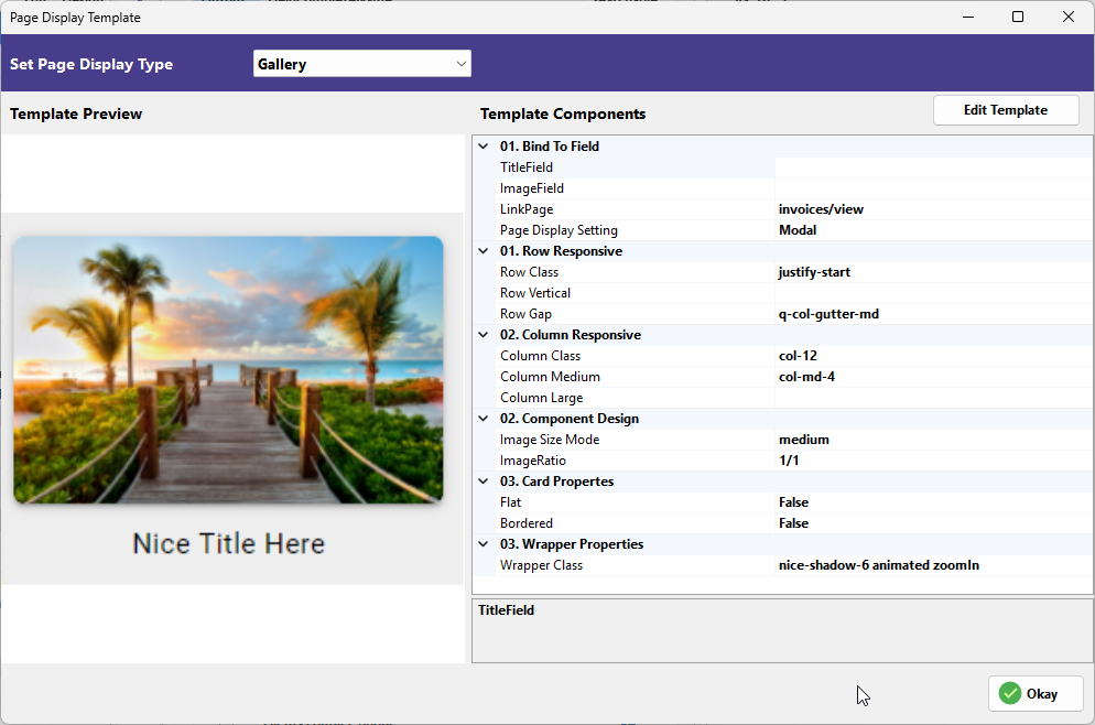
This template prioritizes visual elements, displaying records with large images and minimal text.
-
TitleField: The main text displayed below or on the image.
-
ImageField: The source field for the gallery image.
-
LinkPage: The page to navigate to upon clicking an image.
-
Page Display Setting: Determines if the detail opens InPage or as a Modal.
-
Row Class: Row-level CSS classes.
-
Row Vertical: Vertical alignment for gallery items.
-
Row Gap: Spacing between images.
-
Column Class: Base width of gallery items.
-
Column Medium: Medium-screen width.
-
Column Large: Large-screen width.
-
Image Size Mode: Scaling logic for the gallery images.
-
ImageRatio: Sets the fixed aspect ratio (e.g.,
1/1for square). -
Flat: Removes the card shadow effect.
-
Bordered: Adds a border to the image cards.
-
Wrapper Class: Used to apply animations or shadows to the gallery container.
¶ 5. BlogView (1 & 2)
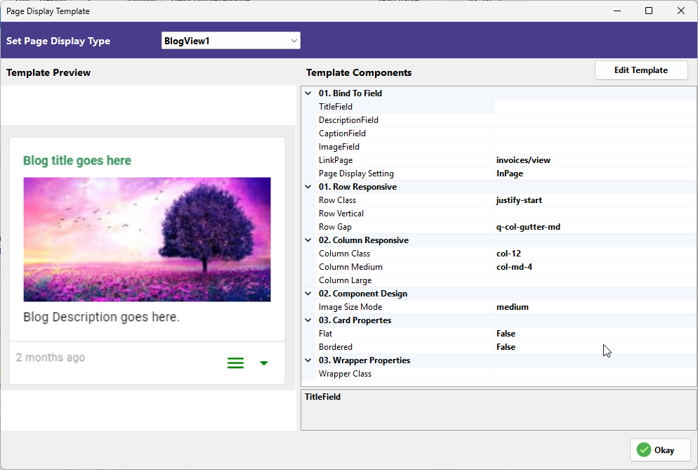
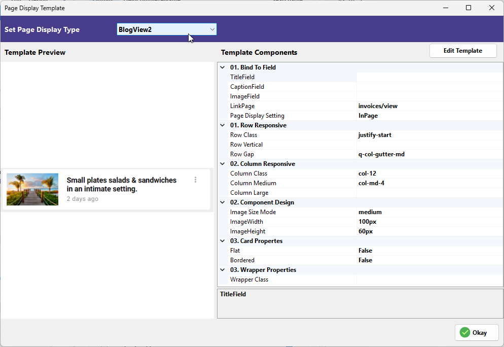
The BlogView templates provide structured layouts for articles or posts, with BlogView1 emphasizing large headers and BlogView2 offering a more compact style.
-
TitleField: The main headline field.
-
DescriptionField: The body or summary field.
-
CaptionField: Often used for the post date or category.
-
ImageField: The main featured image for the post.
-
LinkPage: Destination page for the "Read More" action.
-
Page Display Setting: Logic for opening the full post.
-
Row Class / Row Vertical / Row Gap: Layout controls for the blog list.
-
Column Class / Column Medium / Column Large: Responsive grid settings.
-
Image Size Mode: How the featured image is cropped.
-
ImageWidth / ImageHeight: (Specific to BlogView2) Precise pixel controls for thumbnails.
-
Flat / Bordered: Visual styling for the post cards.
-
Wrapper Class: Container-level CSS customization.
¶ 6. ProfileCard
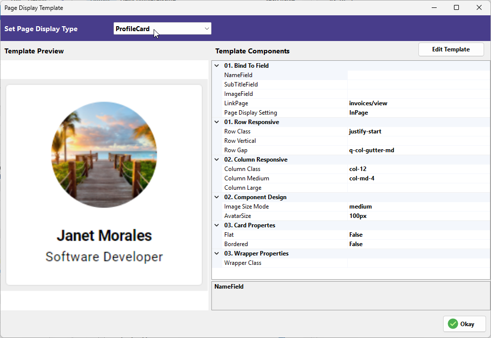
Optimized for user data, the ProfileCard centers a circular avatar and user details.
-
NameField: Binds to the user's name.
-
SubTitleField: Binds to the user's role or secondary info.
-
ImageField: Binds to the user's profile photo.
-
LinkPage: Navigation for the profile view.
-
Page Display Setting: Display logic for the link.
-
Row Class / Row Vertical / Row Gap: Positioning controls.
-
Column Class / Column Medium / Column Large: Grid sizing.
-
Image Size Mode: Crop logic for the avatar.
-
AvatarSize: Diameter of the circular image (e.g.,
100px). -
Flat / Bordered: Styling for the profile card.
-
Wrapper Class: Container CSS.
¶ 7. Custom
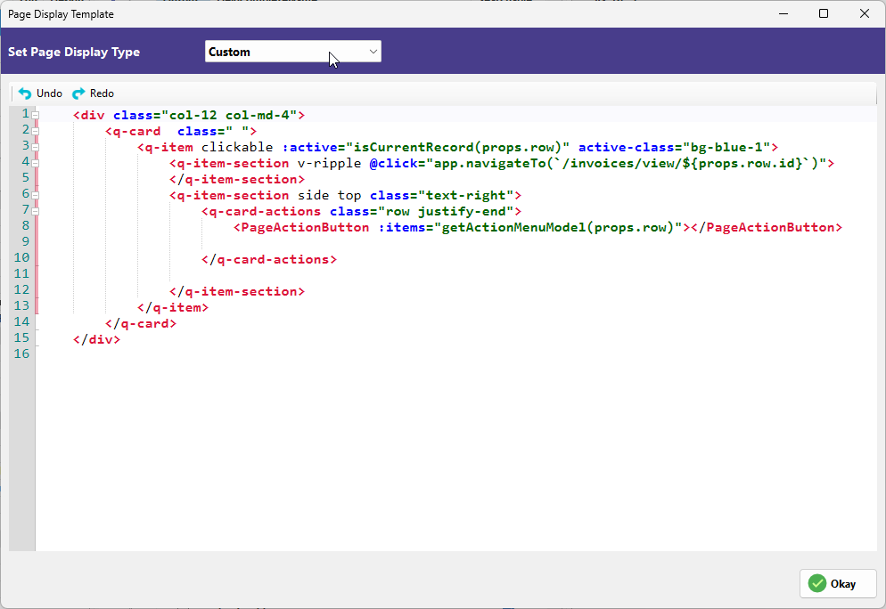
The Custom template opens a full code editor for developers who need to build a layout from scratch.
-
Template Editor: Write custom Vue/HTML code.
-
Props Access: Use
props.row.fieldnameto dynamically inject database values into your custom design.