¶ Page Fields - Types and Settings
RadSystems Studio provides a robust and versatile set of tools for data presentation, moving far beyond simple text displays. On both List and View pages, you can transform raw database values into professional-grade UI components such as interactive images, progress bars, and star ratings to create a more engaging and intuitive user experience. These field properties are rendered using the specific code syntax of the Frontend Framework (such as Bootstrap or Quasar) that you selected during the initial project setup.
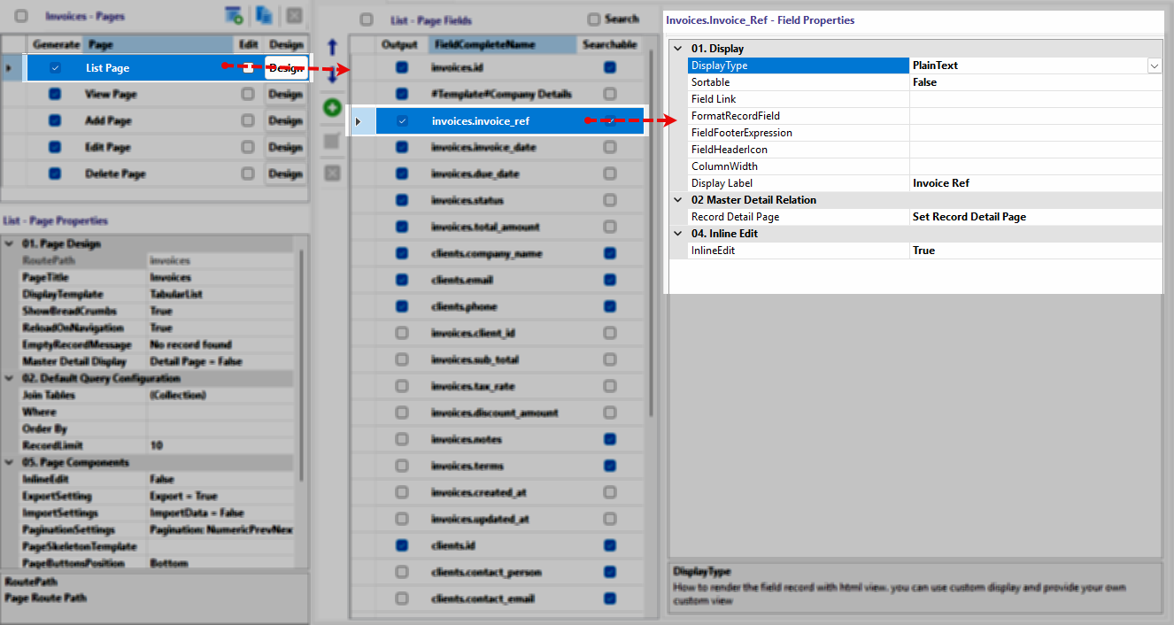
¶ Accessing Page Field Properties
 ![[rs-crud-listfields-overview.webp]]
The interface is structured to allow granular control over every data point in your application:
-
Select the Table: Click on the desired table in the first column.
-
Choose the Page: Click either the List Page or View Page in the second column.
-
Select the Field: Click the specific field in the third column to load its properties into the fourth column.
¶ Common Display Properties
These properties form the foundation of how data is handled and labeled across almost all field types:
DisplayType: Determines the visual component used to render the record.
Sortable: Enables or disables the user's ability to sort the list by this specific column.
Field Link: Defines a navigation path or call to one of the pre-built functions to make the field value clickable. Following pre-built functions can be called to set the field link: CurrentRecordDetail, CurrentFieldCategory, CurrentFieldFile, CurrentFieldValueSearch, CurrentFieldMailTo, CurrentFieldTelTo.
FormatRecordField: Applies framework-specific formatting logic to the data. Following formatting functions are available: human_date, human_time, human_datetime, format_date('Y-m-d H:i:s'), relative_date, format_size, to_currency('en-US'), ucwords, ucfirst, strtolower, strtoupper, str_truncate(50,'...'), approximate(2), to_number, number_to_words('en').
FieldFooterExpression: Sets a summary calculation (like Sum or Average) for the bottom of the column.
FieldHeaderIcon: Adds a decorative icon to the column header.
ColumnWidth: Sets the fixed or relative width of the field in the UI.
Display Label: Defines the user-friendly name shown in headers or detail labels.
¶ Field-Specific Properties
Once a DisplayType is selected, a dedicated section of unique properties will appear below the common settings.
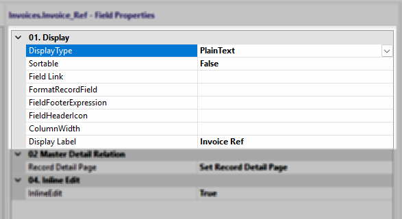
¶ Plain Text
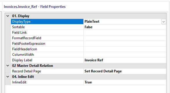
Record Detail Page: Use this setting to define which specific "View" or "Details" page should be loaded when a user clicks on the field value. This is essential for creating a seamless drill-down experience, allowing users to move from a high-level table directly to the comprehensive data for a specific record.
InlineEdit: When this toggle is set to True, the field becomes an editable component (like a text input or dropdown) upon being clicked. Note that this functionality is only available if the InlineEdit component property is also enabled in the general Page Properties section.
¶ Image Properties
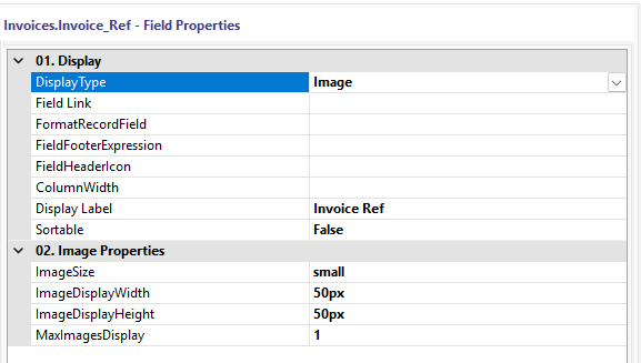
ImageSize: Sets the general thumbnail scale, such as small or medium.
ImageDisplayWidth: Defines the exact pixel width for the rendered image.
ImageDisplayHeight: Defines the exact pixel height for the rendered image.
MaxImagesDisplay: Sets the limit for how many images are shown if multiple paths exist in the field.
¶ Html5Video Properties
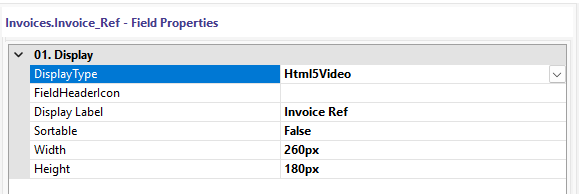
Width: Sets the frame width of the embedded video player.
Height: Sets the frame height of the embedded video player.
¶ StarRating Properties
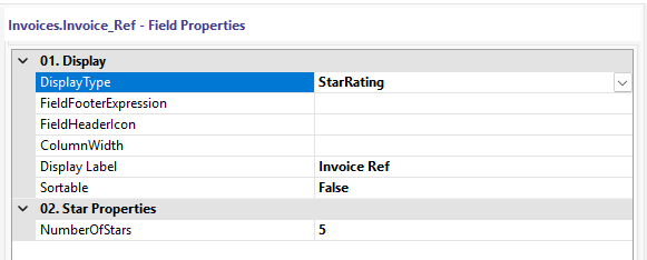
NumberOfStars: Sets the total number of stars available in the rating scale.
¶ ProgressBar Properties
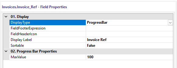
MaxValue: Defines the numerical value that represents a 100% full progress bar.
¶ CheckButton Properties

CheckValue: Defines the specific database value that triggers the "checked" or "active" visual state.
¶ Custom
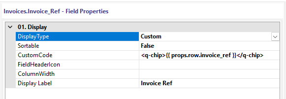
CustomCode: Provides a code editor to write unique HTML or framework-specific template tags for the field.
¶ RelativeDate Properties
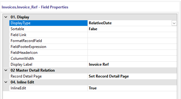
Functionality: This type has no additional sub-properties; it automatically converts timestamps into human-readable strings like "2 minutes ago" or "Yesterday" based on the system clock.
¶ None Properties
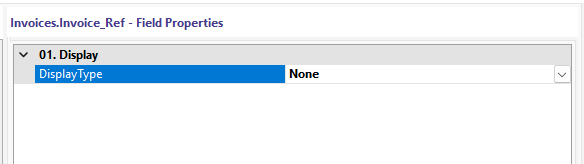
Functionality: This type removes the field from the UI entirely while keeping the data available in the underlying SQL query for background logic.